Young Huh2019

Kips Bay Decorator Show House, New York

The convoluted architectural lines of Young Huh's complex show house space were transformed through Braque's geometric strokes and tumbling shapes of raw colour. 

In 1973, supporters of Kips Bay Boys & Girls Club in New York City came up with an ingenious way to raise funds. They would invite celebrated interior designers to redecorate a luxury Manhattan home and charge visitors a fee on the door. A little left-field, perhaps, for a Bronx-based youth centre – but it was a roaring success.

Since then, the Kips Bay Show House has become a must-see event, taking place at a different house each year. Since its inception, it is estimated to have raised over $17m for after-school and enrichment programs for New York City children.

Fast forward to 2019. Korean American interior designer Young Huh is one of 22 designers asked to transform a sprawling five-story townhouse on the Upper East Side. She is given the fifth-floor loft. But this is not just any fifth-floor loft: narrow spiral staircase, escalating windows, total lack of right angles and a curious mixture of low, double-height and sloped ceilings. Architecturally eccentric would be a polite way to describe it. Plain weird would be another. Young was going to have her work cut out.

But she was ready for the challenge, and we were delighted when she asked if we’d like to collaborate on the project. Her vision was to design a space that she imagined a bohemian woman artist could live and create in. We loved the brief. But transforming this cold, strange, convoluted space into a vibrant, inspiring artist’s studio wasn’t going to be easy. It was clear that the choice of wallcovering would make or break the scheme (we were very much hoping for the latter).

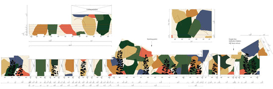
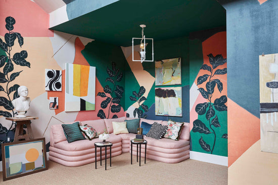
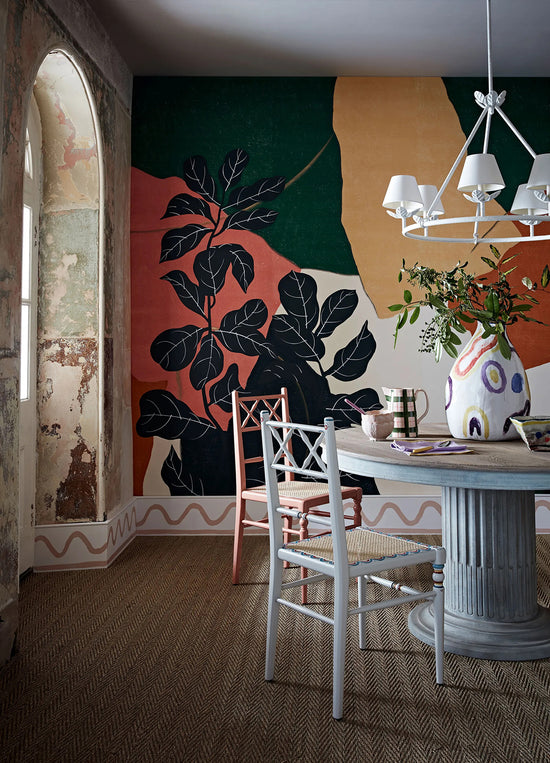
Our Braque design seemed the perfect candidate. Taking inspiration from the early works of Cubism, Braque’s tumbling shapes of raw colour are layered with abstract geometric strokes. We create the backdrop by hand-dying tea paper in a selection of colours before tearing them into large, abstract shapes and carefully arranging them into our composition. These bold, curving geometrics form the basis of the layout with hand-painted ficus flowers adding a sense of nature and movement.

It felt to us that Braque could work in a similar way to ‘dazzle ships’. But not only could the abstract, interrupting forms make it difficult to establish the room’s complex architectural lines – rendering them more palatable – they would bring a colourful, organic, creative feeling too, an essential part of the brief and something that was sorely lacking in that cold, convoluted space.

As is the way with all our hand-painted wallcoverings, we tailored the individual elements of our Braque design specifically to the room – which wasn’t without its challenges. “The pelmet areas were very strange and quite tricky to negotiate,” remembers Fromental co-founder Tim. “You can see in the photographs: the wall juts out then recedes abruptly. Once the wallpaper was installed, this would have a foreshortening effect on the shapes, distorting them. We didn’t want this to create an imbalance with the rest of the scheme.” Tim’s solution was to elongate the geometric shapes, so they would still ‘read’ once integrated into the room.

This and every other tiny detail of the design layout was meticulously planned very early on in the project to avoid any nasty surprises further down the line. “A lot of hard work goes into the preparations for an installation like this,” says Tim, “but we always want our sweat and toil to be utterly invisible in the finished work. It needs to feel harmonious and balanced – effortless.”

The hard work paid off. This cold, architecturally strange, domineering space was transformed into a vibrant yet comfortable artist’s studio. We were delighted with the results.

“It had a certain domesticity to it,” says Tim. “You could live in that space and love it. Braque is extremely bold, but it’s deceptively accommodating. It became a backdrop to a series of framed artworks curated by Young, and it wore them very well. That was something of a surprise, even for us.”

“There’s an intellectual rigour with Tim and Lizzie that makes its way into all of their designs,” says Young. “People loved that about our collaboration – the wallpaper started so many conversations. Fromental aren’t just a supplier, they’re a creative partner and were as excited about the possibilities as I was. That kind of relationship is so rewarding.”

In this article:

Braque in Grasse

Braque in Grasse

View Design

Keep Reading On...

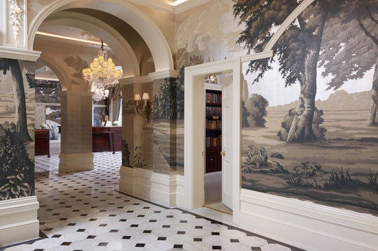
The Goring Hotel, London

Bucolic in SaxeWallcovering

A joyful, allegorical custom scenic in a traditional bucolic guise, designed in collaboration with Russel Sage. 

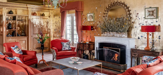
Glenmorangie House, Scotland

Clef des ChampsWallcovering

A visual retelling of the Glenmorangie story, in collaboration with Russel Sage.